MarinaForHire.com Minimalist Redesign
This is for an older version of the site.
On August 1, 2013, I wrote a post about my upcoming website redesign. At the time it was just a sketch and a Photoshop mock of the original draft of this site.
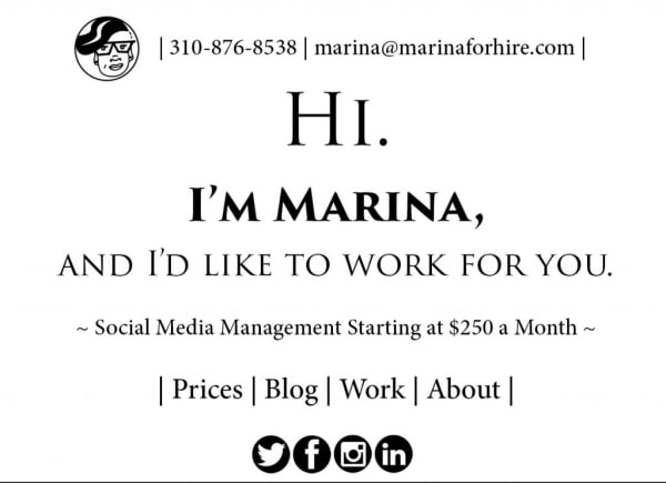
I wanted something that was easy to use, not distracting or noisy. Potential clients should feel relaxed when they came to the site, but they should also know what I do and be able to find what they were looking for without any hassle. That’s why the search bar and my contact information share equal space at the top of the screen. In an effort to make the site more user friendly, I got rid of the majority of my old menu items, turning some of them, like the awards page, into blog posts, but getting rid of others entirely.
Even though the site is about me, I wanted it to be as open and friendly to clients and potential clients as it possibly could be. I’m really proud of the new design,
Goals
- Redesign my website so it is easy to use with easily accessible information
- Prioritize making clients and potential clients feel relaxed by creating a site that is open and friendly
Outcomes
- In the new design, the search bar and contact information shared equal space at the top of the screen
- To make the site more user-friendly, I got rid of the majority of old menu items