ESMoA.org Website Build
Note: This is for am earlier version of the ESMoA site that no longer exists.
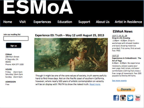
From their sun-lit, custom designed building to their bold sans-serif logo and expertly laid out print work, I knew that ESMoA.org would rely on straight lines and an intuitive frame. I wanted to let the content speak for itself. I also knew that the staff would be updating the site themselves several times a day and I didn’t want it to be difficult or frustrating to work with. Taking a cue from their white on black logo, I started with a bold true-black header and clear horizontal menu. Then I made a lefthand sidebar for the most relevant, as well as the most call-to-action content, since users eyes tend to settle on the left-hand side of a site last, when they’re ready to engage more fully.
The homepage at ESMoA.org has an additional right-hand sidebar that was conceived by the museum’s designer in order to place the most relevant information front and center for site visitors. Every step of the collaborative design process was made with usability and clarity in mind. ESMoA is a community institution, and we very much wanted every member of that community to find exactly what they were looking for when they logged on.
On the usability side, we worked with WordPress custom post-types to make it easy to add a variety of content without increasing complexity behind the scenes. We used post-categories to automatically populate a majority of the repeating content, cutting the potential workload way down. For example, an Experience themed tango class might show up on the Program page, on the corresponding Experience page, on the Adult page in the Education section, and in the sidebar with three simple clicks. Then when it is no longer upcoming, the event automatically leaves the sidebar and moves to the “Past Events” section in the Program. One click relegates past events and Experiences to the “Past Experiences” section and out of the current Program without taking them out of any Education pages they may be showcased in.
Goals
- Build a website for EsMoA that reflects their bold and clean aesthetic
- Center the community in the design, making it easy for community members to find exactly what they're looking for
- Make it easy to add a variety of content
Outcomes
- I designed a bold true-black header and clear horizontal menu that let the content speak for itself
- The collaborative design process resulted in additional sidebars to highlight the most relevant content for users
- Wordpress custom post-types allowed us to automatically populate a majority of the repeating content, cutting down on the time it took to update the site on an ongoing basis