Logo Reconstruction: Action Works
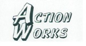
Action Works, a business services firm in Los Angeles wanted to return to the original version of their logo for an upcoming redesign, but they only had a scan of an old fax with the logo on it. Everything else had been lost; the logo was made before digital back-ups were industry standard. I assured them that I could work with anything and shortly received this file:
As you can see, the image is extremely blurry, and some of the letters have become distorted, possibly through repeated faxing.
Without hesitation, I imported the image into Sketchbook and using my Samsung Galaxy Note 2 as a tablet (see Face Icon: Me for more info on why I employ this process), I started sketching the general shape of the icon.
Here are some later sketches from that process.
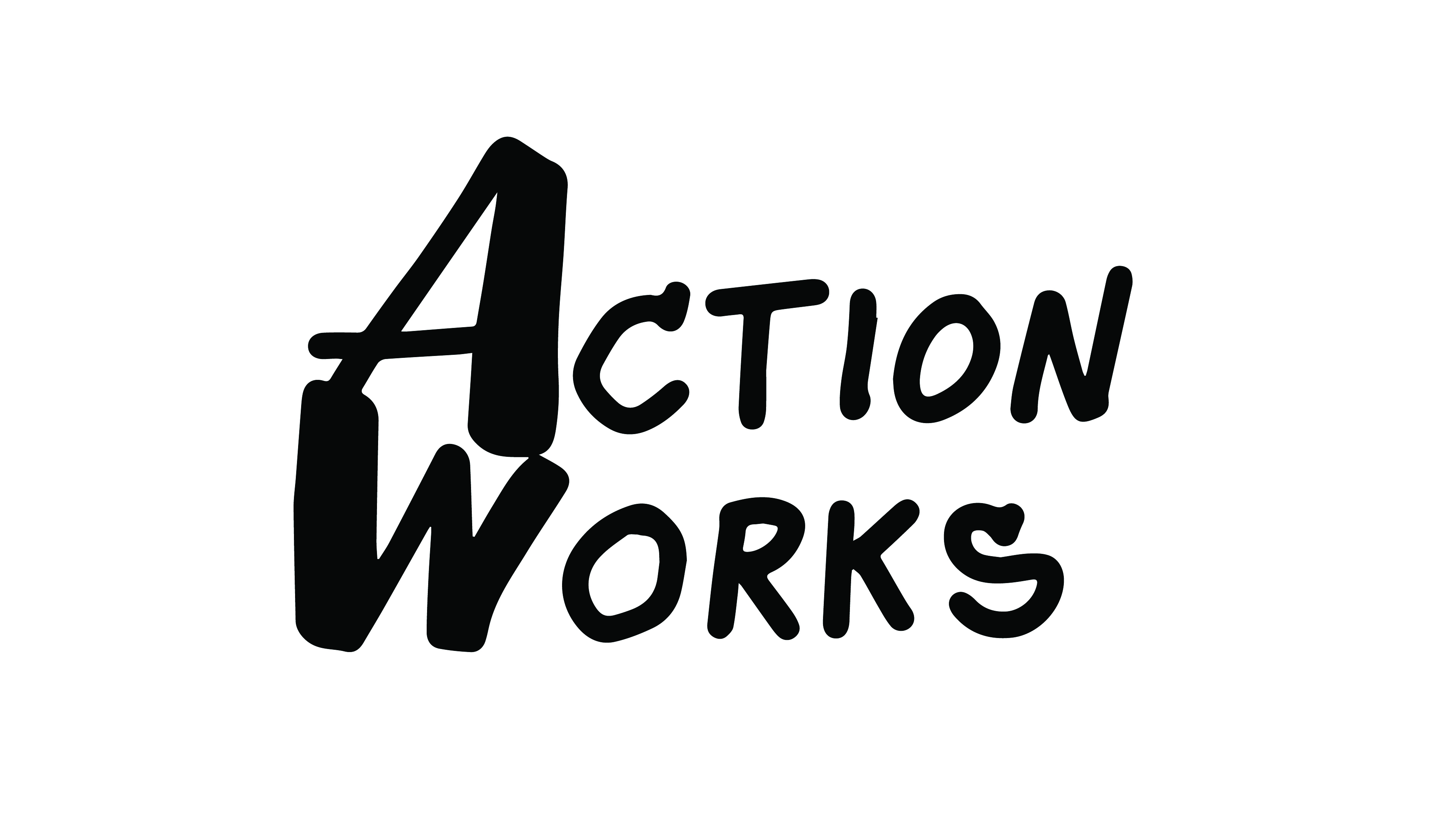
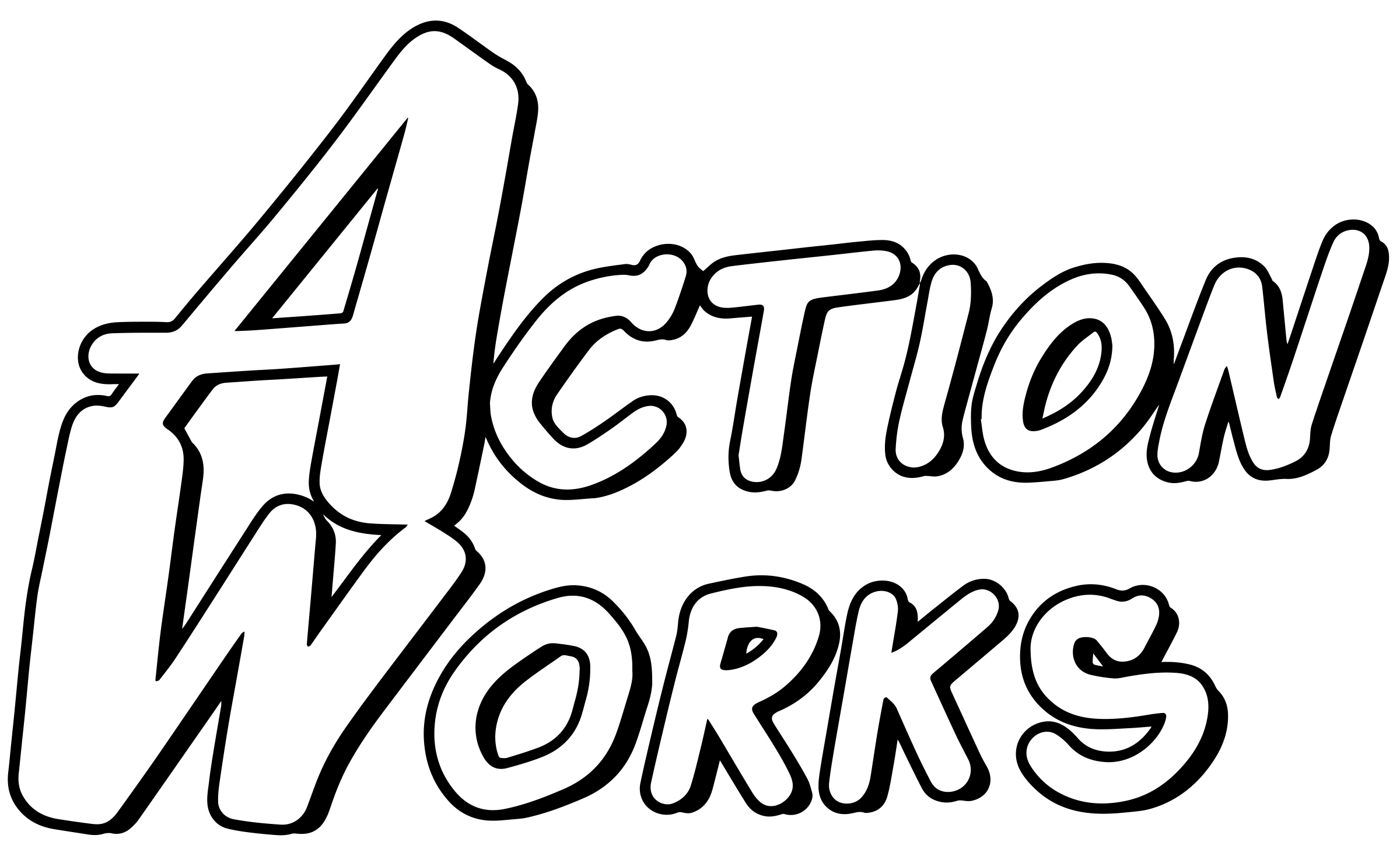
At this point, the logo was Illustrator ready. After some finishing touches, I produced a final that was ready for "action."
As you can see, the new version is slightly different from what the original looked like, this is due in part to the fact that the original was so very degraded, it was difficult to know what was line and what was corruption. The change is also due to some stylistic choices (most notably the A/W overlap) and accounts for the correction I did to the character warping.


