Firefighter Health and Safety Campaign
In March my client and fellow union woman Barb Maynard came to me with a health and safety campaign for Los Angeles firefighters. The team was under a deadline, as the County was threatening to move forward on installing untested high-output radio towers on more than 160 fire stations and lifeguard towers.
Laws that prevented the towers from being placed in residential areas or near schools could be ignored if the installations were on county property, including neighborhood fire stations. Firefighters and their supporters wanted testing, but Los Angeles was in danger of losing federal money if they paused the project for health and safety tests. With a crucial meeting fast approaching, it was time to take the issue to the people.
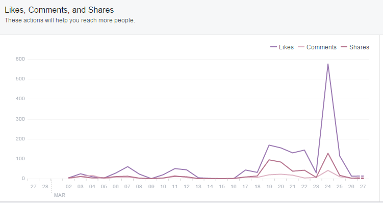
After talking about our goals and desired outcomes, we decided to launch an extremely geo-targeted Facebook Ads campaign in order to reach as many residents as possible and encourage them to speak up for firefighters with their local County Supervisors. Over the course of the campaign we reached clickthrough rates (CTR) of over six percent, a monumental success compared to the average Facebook CTR, which is reported as being between one and two percent.
We learned quite a few things throughout this campaign. Primarily that Facebook is an extremely closed community with very little traffic in from sites outside of itself. Even on our most trafficked day, only six people came through external sites. As a result, our campaign had to be designed to appeal to Facebook's unique environment.

Facebook users are intensely visually-oriented, but there are already a lot of different images competing for their attention. When we ran a campaign interchanging three relatively neutral images, the ads did fairly well. However, the campaigns which inserted a fourth image that was much more visually arresting either outperformed the neutral ads or came in a close second. While mundane imagery can blend into the background and be quickly forgotten, radical or inflammatory visuals catch the user's eye and engage their emotions, either positively or negatively.
We also learned that even negative engagement was good for our campaign, because it allowed our supporters to get personally involved. We realized early on that our most controversial ads, including those which garnered oppositional comments, were also our most successful. Having ads that engaged detractors and allowing their comments to stay online instead of deleting or hiding them gave our supporters a chance to use their voices to defend our cause.

The personal element is key. While video in general garnered the most successful engagement of the campaign, the testimonials from firefighters filmed entirely on cell phones received more views than our professionally-made video. The craftsmanship of the professional video was overshadowed by the fact that the other two had real people in them relating the ways in which they were personally affected by this issue. What Facebook users really come to Facebook for is to connect with other people, and putting a face and voice to those directly affected was instrumental in engaging followers' investment in protecting firefighters from the risk posed by the high-output radio towers.
Our Facebook campaign was massively successful. We nearly tripled the number of followers and rallied their voices enough to force the attention of the County Supervisors. At the Board of Supervisors meeting, the vote passed to halt the construction of radio towers at fire stations until further study could be conducted. Because we were attentive to the numbers, we used visually stimulating content, and we encouraged discourse on our posts, our followers were charged up and eager to help bring a win for their local fire fighters.