Redesign and Update for Classic Parking
Classic Parking, a family owned and operated business based in the heart of Downtown Los Angeles, has been serving Southern California and surrounding areas since 1929. In addition to the original parking management services, they now offer transportation through CP Transportation, and security with Classic Protection.
The company website hadn't been updated in several years, and they were looking for a fresh new look that would showcase their three companies, while being easy to use, and retaining the Classic Parking branding that their clients have come to trust. On a visit to the company offices located in an iconic downtown hot spot, I asked the team what they wanted visitors to see when they clicked on ClassicParking.com.
"That we're easy to work with" was one answer.
"That we put people first" was another.
I began formulating an idea for a site that would embody the people aspect in the form of three models: one for each company.
Through talking with Classic about what people meant to them, we decided to use actual classic employees from each of the three companies to be the models in question. We felt that, by using people clients may actually work with, we were emphasizing the true face of classic.
I commissioned local photographer Sean McCabe to shoot the staff for me. He took hundreds of pictures in order to get exactly the right ones.
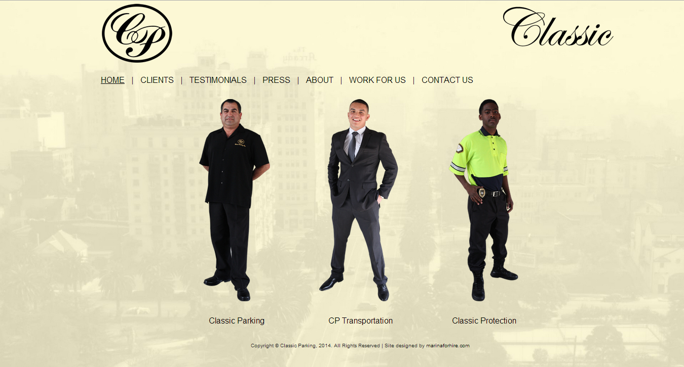
At first, I wanted the models floating on a white space, but the expanse of white on larger screens seemed empty, rather than clean. I found an aerial image of 1940's Lafayette Park in the public record and faded it out with a sepia overlay. The average user will probably not recognize Wilshire winding out Eastward behind the scenes, but they will catch the classic architectural styling of our iconic city, even if only in passing.
I off-set the menu in order to showcase the models, and so as to not over-burden the middle of the screen. In contrast to the Edwardian Script of the page titles, I made everything else a simple Arial in order for it to be legible and not clash with the other visual elements.
Because the team at Classic rarely update their site, and because they have an IT person who is knowledgeable about HTML, I made their site in easy to read, easy to edit, clean HTML. The work is entirely portable. I also sent them the Docpad files at the end of the project so they can reboot if anything goes wrong.
Classic were easy to work with, their site was fun to think about and design, and their organized, responsive staff were a dream to photograph. I would recommend Sean to anyone for event or still photography.
If you'd like to know more about HTML-only sites, or if you have questions about your upcoming site redesign, give me a call. I'm always interested to hear about new projects.