post
Marinaforhire.Com Redesign
I've long felt that the current site layout is too crowded and complicated, but I've been too busy to tackle a redesign.
I'm not any less busy now, in fact quite the opposite, but I couldn't take it any more. A couple of days ago over lunch I sketched out some ideas for what a new site might look like. I wanted people to be able to know what I do without being overwhelmed by chatter. My favorite sketches were simple, with lots of white space and direct language.
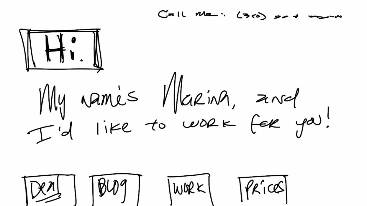
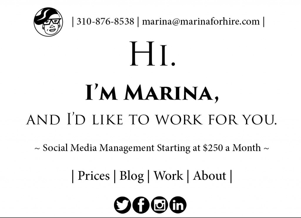
I also put my contact information at the very top of the page, because I want people to know they can always contact me personally if they have any questions.
This isn't the finished product, but it's what I'm leaning towards very strongly. What do you think?
~ M ~